Table of contents
- Quick recap
- Let’s dive into the code
- Step 1: Create a custom modifier using approachLayout Modifier
- Step 2: Define the parent and animation states
- Step 3: Define the movable contents for the header section
- Step 4: Use the defined movable contents for the header section
- Step 5: Define the movable contents for the attribute section
- Step 6: Use the defined movable contents for the attributes section
- Additional resources
- Conclusion
This post is a continuation of my previous blog about the LookaheadScope API in Jetpack Compose, where I delved into various APIs and demonstrated an example animation utilizing Box layouts. If you haven’t read it yet, I strongly encourage you to do so before proceeding. The concepts covered in that post will be foundational to our discussion here.
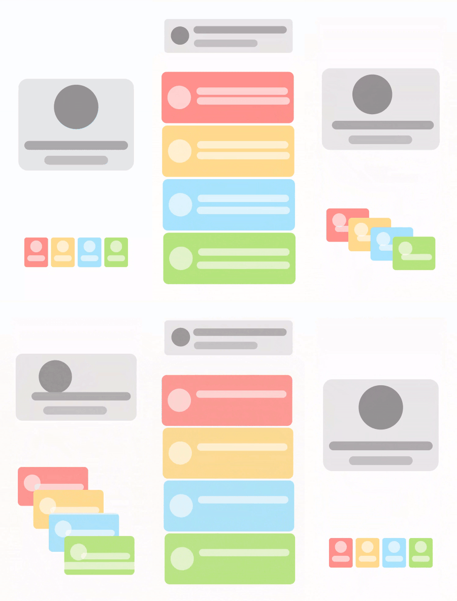
This post aims to provide a clear and straightforward explanation of how to create a container transform animation using Lookahead APIs. In the end, we will end up creating a UX like this:

Quick recap
Let's quickly go through some points we know about LookaheadScope. These concepts are discussed in more detail in my previous article.
The LookaheadScope API allows us to “look ahead” and pre-calculate the size and position of the target destination while animating. It achieves that using a “lookahead pass” before the actual measure/layout pass.
Using these pre-calculated values, we can decide an approach logic in the “approach pass” of how to gradually reach this destination state, which will define the animation.
What is a container transform animation?
Container transform animation is a design pattern that morphs one UI container into another, often employing a shared element to bridge two UI components. It uses persistent elements to create a smooth and seamless transition between the starting and ending states.
Let’s dive into the code
In the previous article, we explored the movableContent and movableContentWithReceiverOf APIs of Jetpack Compose. The latter allows the creation of movable content within a receiver context, enabling the preservation of state while content is repositioned. We will extensively leverage this API in conjunction with LookaheadScope to create the UX described earlier.
The UX design in question consists of two main components: a top/center header card layout featuring a circle and two rounded rectangles, and a lower layout composed of four colored attribute cards, each adorned with a circle and one or two rounded rectangles. This setup is conceptual, and designed for simplicity. In practical applications, these shapes could be replaced with Image and Text composables without affecting the functionality.
Step 1: Create a custom modifier using approachLayout Modifier
As elaborated in the previous post, we will now develop a custom modifier named animateLayout by leveraging the approachLayout Modifier. The approachLayout modifier plays a crucial role during the approach pass and is utilized within LookaheadScope to delineate the method by which a composable should measure and place its content throughout the animation process.
Within the isMeasurementApproachComplete and isPlacementApproachComplete checks, we'll determine whether our measurement and placement processes have reached their intended destinations. To accomplish this, we will employ the lambda arguments lookaheadSize and lookaheadCoordinates to craft our logic. In this scenario, we're opting for a tween animation with a duration of 1800 milliseconds to slow down the animation, enhancing its visibility and allowing for a more detailed observation.
In the trailing lambda of approachMeasure, we will define an interpolation method for the animation. This interpolation will smoothly transition the measurement or placement from its previous size and position to the designated target size and position. We'll ascertain the target size using lookaheadSize, and the target position through lookaheadCoordinates and localLookaheadPositionOf.
It’s important to note that localLookaheadPositionOf is utilized for obtaining the converted offset relative to a specific position coordinate within the Lookahead coordinate space. This technique ensures that the animation transitions are smooth and precise, directly correlating the starting points to their final destinations based on the defined animation parameters.
context (LookaheadScope)
@OptIn(ExperimentalAnimatableApi::class, ExperimentalComposeUiApi::class)
fun Modifier.animateLayout(): Modifier = composed {
    val sizeAnim = remember { DeferredTargetAnimation(IntSize.VectorConverter) }
    val offsetAnim = remember { DeferredTargetAnimation(IntOffset.VectorConverter) }
    val scope = rememberCoroutineScope()
    this.approachLayout(
        isMeasurementApproachComplete = { lookaheadSize ->
            sizeAnim.updateTarget(lookaheadSize, scope, tween(1800))
            sizeAnim.isIdle
        },
        isPlacementApproachComplete = { lookaheadCoordinates ->
            val target = lookaheadScopeCoordinates.localLookaheadPositionOf(lookaheadCoordinates)
            offsetAnim.updateTarget(target.round(), scope, tween(1800))
            offsetAnim.isIdle
        }
    ) { measurable, _ ->
        val (animWidth, animHeight) = sizeAnim.updateTarget(lookaheadSize, scope)
        measurable.measure(Constraints.fixed(animWidth, animHeight))
            .run {
                layout(width, height) {
                    coordinates?.let {
                        val target = lookaheadScopeCoordinates.localLookaheadPositionOf(it).round()
                        val animOffset = offsetAnim.updateTarget(target, scope)
                        val current = lookaheadScopeCoordinates.localPositionOf(it, Offset.Zero).round()
                        val (x, y) = animOffset - current
                        place(x, y)
                    } ?: place(0, 0)
                }
            }
    }
}
After creating the animateLayout modifier, it becomes a powerful tool that we can employ to animate our UI elements in subsequent sections of the code.
Step 2: Define the parent and animation states
First, we’ll construct the top/center header card layout followed by the bottom layout. It’s crucial to recognize that the layout transitions between two states. These states switch upon tapping the screen or parent container. To manage this behavior, we’ll begin by defining our parent composable. We will also introduce a mutable Boolean state, named isExpanded, to represent the toggle state. This flag will be instrumental in controlling the animation, dictating whether the layout is in its expanded or non-expanded form based on user interaction.
@Composable
fun ContainerTransformAnimationWithLookahead() {
    var isExpanded by remember { mutableStateOf(false) }
    Surface(
        modifier = Modifier.fillMaxSize().clickable { isExpanded = !isExpanded },
        color = Color(0xFFFFFFFF)
    ) {
        // Content here
    }
}
Step 3: Define the movable contents for the header section
For the top header card view, we have 4 movable contents:
Header image (Circle)
Header title (Long rounded rectangle)
Header subtitle (Short rounded rectangle)
Header container (Card container)
For each one of these, we have to define remembered tracking composable lambdas. We will leverage movableContentWithReceiverOf with LookaheadScope for this.
Let’s do it first for the header image:
val headerImage = remember {
    movableContentWithReceiverOf<LookaheadScope, Modifier> { modifier ->
        Box(
            modifier = Modifier
                .animateLayout()
                .then(modifier)
                .drawBehind {
                    drawCircle(Color(0xFF949494))
                }
        )
    }
}
Here’s what’s happening: Each component is encapsulated within a remembered composable lambda, enabling it to be tracked. This ability to track compositions facilitates the creation of a composable that dynamically switches its content layout between a row and a column, contingent upon a specific parameter. We’ve employed the animateLayout() Modifier, introduced earlier, to generate the actual animation effect.
The LookaheadScope is utilized as the receiver context, a necessity for the animateLayout() modifier to function properly. Moreover, we've incorporated a Modifier as a parameter, allowing for external style adjustments that correspond with the layout transitions. This modifier is appended using .then(modifier) after applying animateLayout(). It's important to note that styling elements intended to remain consistent across different layout (or animated) states should be explicitly defined within this composable at the time of its creation, ensuring a seamless transition and maintaining visual coherence throughout the animation process.
Similarly, we will define the header title and subtitle:
val headerTitle = remember {
    movableContentWithReceiverOf<LookaheadScope, Modifier> { modifier ->
        Box(
            modifier = Modifier
                .animateLayout()
                .then(modifier)
                .graphicsLayer {
                    clip = true
                    shape = RoundedCornerShape(100)
                }
                .background(Color(0xFFACACAC))
        )
    }
}
val headerSubTitle = remember {
    movableContentWithReceiverOf<LookaheadScope, Modifier> { modifier ->
        Box(
            modifier = Modifier
                .animateLayout()
                .then(modifier)
                .graphicsLayer {
                    clip = true
                    shape = RoundedCornerShape(100)
                }
                .background(Color(0xFFC2C2C2))
        )
    }
}
Now, we will define the header container, which will hold the above three elements. This is a bit different from the above implementations. Let's see the code:
val headerContainer = remember {
    movableContentWithReceiverOf<LookaheadScope, @Composable () -> Unit> { content ->
        Box(
            modifier = Modifier
                .animateLayout()
                .padding(16.dp)
                .graphicsLayer {
                    clip = true
                    shape = RoundedCornerShape(10)
                }
                .background(Color(0xFFE7E7E7))
        ) {
            content()
        }
    }
}
In this scenario, everything remains consistent with the previous components, with the notable exception of the argument type: instead of a Modifier, a Composable function is used. This adjustment is made because a Modifier isn't required for this specific use case, as the card's styling remains constant across both states. Instead, what's needed is a way to pass content into this Box—specifically, the three UI elements: image, title, and subtitle. The rationale behind this approach and its practical application will become more apparent through examples showcasing its usage.
Step 4: Use the defined movable contents for the header section
Now, we will employ the movable contents defined earlier to construct two layouts, toggling between them based on the isExpanded Boolean flag. All of these operations will occur within the LookAheadScope. It's crucial to understand that without LookAheadScope, our movable contents cannot be utilized. This scope provides the necessary context for our movable content to function correctly, enabling the seamless transition between expanded and non-expanded states as dictated by the isExpanded condition.
LookaheadScope {
    Column(
        modifier = Modifier.padding(horizontal = 16.dp, vertical = 32.dp),
        horizontalAlignment = Alignment.CenterHorizontally
    ) {
        Box(
            modifier = Modifier.fillMaxSize().weight(if (isExpanded) 1f else 4f),
            contentAlignment = if (isExpanded) Alignment.TopStart else Alignment.Center
        ) {
            if (isExpanded) {
                headerContainer {
                    Row(
                        modifier = Modifier.padding(16.dp),
                        verticalAlignment = Alignment.CenterVertically
                    ) {
                        headerImage(Modifier.size(48.dp))
                        Spacer(Modifier.width(16.dp))
                        Column {
                            headerTitle(Modifier.height(20.dp).width(280.dp))
                            Spacer(Modifier.height(16.dp))
                            headerSubTitle(Modifier.height(20.dp).width(172.dp))
                        }
                    }
                }
            } else {
                headerContainer {
                    Column(
                        modifier = Modifier.padding(16.dp),
                        horizontalAlignment = Alignment.CenterHorizontally
                    ) {
                        headerImage(Modifier.size(120.dp))
                        Spacer(Modifier.height(32.dp))
                        headerTitle(Modifier.height(24.dp).width(280.dp))
                        Spacer(Modifier.height(16.dp))
                        headerSubTitle(Modifier.height(24.dp).width(172.dp))
                    }
                }
            }
        }
      // Remaining code of the screen to be continued here
    }
}
The provided code outlines two distinct layouts: one displaying the header card section at the top of the screen (in its expanded state) and the other showing it in the middle of the screen (in its non-expanded state). For both layouts, we’ve utilized the headerContainer as the movable content container, incorporating headerImage, headerTitle, and headerSubTitle as its contents. Additionally, we've applied specific styling to these elements using the previously defined Modifier argument.
This setup allows for dynamic styling adjustments — specifically, the width and height of the elements — based on whether the layout is in its expanded or non-expanded state, as well as its positioning. The Lookahead API is tasked with animating these changes, ensuring a smooth transition between states.
With this, we conclude the discussion on the header section.
Step 5: Define the movable contents for the attribute section
Moving on to the attribute cards section, I’ll keep the explanation brief as we’ll be applying the same concepts introduced previously.
Let’s define the movable contents for the attributes container for four colored Boxes, the image, title, and subtitle.
val attributeColors = listOf(
    Color(0xFFFF928D),
    Color(0xFFFFDB8D),
    Color(0xFFA7E5FF),
    Color(0xFFB6E67F),
)
val attributes = remember {
    movableContentWithReceiverOf<LookaheadScope, Modifier, @Composable () -> Unit> { modifier, content ->
        attributeColors.forEach { color ->
            Box(
                Modifier
                    .animateLayout()
                    .graphicsLayer {
                        clip = true
                        shape = RoundedCornerShape(10)
                    }
                    .background(color)
                    .then(modifier)
            ) {
                content()
            }
        }
    }
}
val attributeImage = remember {
    movableContentWithReceiverOf<LookaheadScope, Modifier> { modifier ->
        Box(
            modifier = Modifier
                .animateLayout()
                .then(modifier)
                .drawBehind {
                    drawCircle(Color(0x99FFFFFF))
                }
        )
    }
}
val attributeTitle = remember {
    movableContentWithReceiverOf<LookaheadScope, Modifier> { modifier ->
        Box(
            modifier = Modifier
                .animateLayout()
                .then(modifier)
                .graphicsLayer {
                    clip = true
                    shape = RoundedCornerShape(100)
                }
                .background(Color(0x99FFFFFF))
        )
    }
}
val attributeSubtitle = remember {
    movableContentWithReceiverOf<LookaheadScope, Modifier> { modifier ->
        Box(
            modifier = Modifier
                .animateLayout()
                .then(modifier)
                .graphicsLayer {
                    clip = true
                    shape = RoundedCornerShape(100)
                }
                .background(Color(0x99FFFFFF))
        )
    }
}
Note that here, for the attributes component, the movableContentWithReceiverOf takes both a Modifier and Composable content as arguments. The modifier will help us to pass styles for the Box container while using them in animation.
Step 6: Use the defined movable contents for the attributes section
Similar to what we have done previously, we will use the movable contents to define two layouts: one for the expanded state and another for the non-expanded state. Also, we will switch between them based on the isExpanded flag.
LookaheadScope {
    Column(
        modifier = Modifier.padding(horizontal = 16.dp, vertical = 32.dp),
        horizontalAlignment = Alignment.CenterHorizontally
    ) {
        // Previous code for the header section
        Box(
            modifier = Modifier
                .weight(if (isExpanded) 4f else 1f)
                .padding(horizontal = 8.dp)
        ) {
            if (isExpanded) {
                Column(
                    verticalArrangement = Arrangement.spacedBy(8.dp)
                ) {
                    attributes(
                        Modifier.height(140.dp).fillMaxWidth()
                    ) {
                        Row(
                            modifier = Modifier.padding(16.dp).fillMaxSize(),
                            verticalAlignment = Alignment.CenterVertically
                        ) {
                            attributeImage(Modifier.size(64.dp))
                            Spacer(Modifier.width(16.dp))
                            Column {
                                attributeTitle(Modifier.height(20.dp).fillMaxWidth())
                                Spacer(Modifier.height(16.dp))
                                attributeSubtitle(Modifier.height(20.dp).fillMaxWidth())
                            }
                        }
                    }
                }
            } else {
                Row(
                    horizontalArrangement = Arrangement.spacedBy(8.dp)
                ) {
                    attributes(
                        Modifier.size(width = 64.dp, height = 80.dp)
                    ) {
                        Column(
                            modifier = Modifier.fillMaxSize().padding(8.dp),
                            horizontalAlignment = Alignment.CenterHorizontally
                        ) {
                            attributeImage(Modifier.size(32.dp))
                            Spacer(Modifier.height(8.dp))
                            attributeTitle(Modifier.height(16.dp).fillMaxWidth())
                        }
                    }
                }
            }
        }
    }
}
Note that here, we have omitted the attributeSubtitle in the non-expanded state. This is because we do not want it for the smaller card view in the non-expanded condition.
Also, it’s important to note that we adjusted the weight of the Box composables for header and attribute sections based on the isExpanded flag. This was important for our layouts to move up and down accordingly.
That’s it. If we run the above code now, we will see the desired animation as shared in the beginning.
We can also experiment by not omitting the attributeSubtitle rather, changing its size to 0.dp for the non-expanded state:
attributeSubtitle(Modifier.size(0.dp))
This will create an effect where the subtitle in the attributes section will shrink and disappear after animating to the non-expanded state:

The full code for this is available here.
Additional resources
If you want to learn more about how Lookahead works internally, I highly recommend this blog “Introducing LookaheadLayout” by Jorge Castillo: https://substack.com/inbox/post/64358322.
Also, the official docs for LookaheadScope: https://developer.android.com/reference/kotlin/androidx/compose/ui/layout/LookaheadScope.
And, my previous blog: Animations with Lookahead in Jetpack Compose.
Conclusion
I hope this article sheds light on the diverse possibilities that the LookaheadScope APIs can unlock. Although this API is currently experimental and subject to future changes, one thing is certain: it represents a promising tool that could significantly simplify animation in Compose development.

